39542-research-project
Note that links in this README page leads to the github.io page versions of various files and not their github.com versions.
Optional research project for the CSCI 39542 “Introduction to Data Science” course.
Nature of Project
This is an optional research project offered by the instructors of CSCI 39542 “Introduction to Data Science” at Hunter College. The student does most of the work for the project (deciding project scope, collecting data sets, analyzing data sets, etc) independently with a small amount of instructor oversight.
Purpose of Project
This specific project aims to make some observations on the availability of affordable housing in New York City in the last few years.
I intend to assess the following:
- the distribution of affordable housing in New York City, calculated per zip code
- both in terms of raw housing numbers and housing as a proportion of in-need people
- the distribution of the affordable housing / in-need people disparity
- the change of this disparity over the course of several years
Note that I am not a professional in city planning or otherwise well-versed on the intricacies of affordable housing. The observations made in this project are not legal or policy advice and should not be taken as indisputable truth.
Project Procedures
For this project I took the following steps:
- Acquire the raw data sets. A full list of sources of the various data sets I used can be found in COPYRIGHT.txt. Most of the data sets came from the US Census and NYC Open Data.
- Clean up the Affordable Housing data by replacing NA values with appropriate placeholders.
- Clean up the Income by ZIP data. Since there are multiple data sets for this part (one per year to be analyzed), I called the clean-up function a bunch of times.
- Expand Income by ZIP data. I added several columns to each Income by ZIP data file corresponding to data that might aid me in my analysis. Some of these columns came in handy.
- Run predictive modeling (Polynomial model with LassoCV) on the expanded data. I chose this model because at the start of this project I was expecting to find some sort of correlation between two variables I was already thinking about.
- Draw graphs. I drew some graphs for the 2021 Income by ZIP data and model to establish a general understanding on individual data sets, another graph on all of the predictive models to compare them, and some HTML maps to show some trends.
Project Findings and Visualizations
Here are some visualizations produced and their implications.
Image 1: a comparison between Average Median Income and Housing to Household Ratio, per ZIP, for 2021:
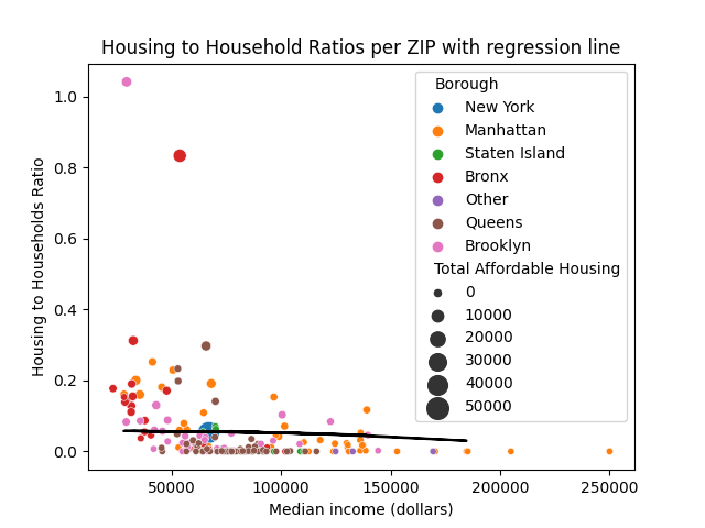
Important notes:
- The dot for “New York” only scales up to 50,000 units of Total Affordable Housing. This is an incorrect value. I chose to scale down the actual value (in the range of 200,000) because otherwise the dots for all the other ZIPs will all have the same size (due to New York City skewing the distribution).
- The black line near the bottom trail of dots is the regression line for this data set.
- “Housing to Households Ratio” (H/H Ratio) denotes the percentage of total low-income in-need households in this ZIP code that can be supplied with affordable housing for their tier, assuming every housing unit is issued to a household that falls under the appropriate income bracket.
Here we can see a few trends:
- Most ZIPs fall below a 0.2 Housing to Households Ratio.
- Richer ZIP codes tend to have very low to 0 H/H Ratios (indicating a scarity of affordable housing there).
Image 2: a regression graph showing the inaccuracy of the model for 2021.
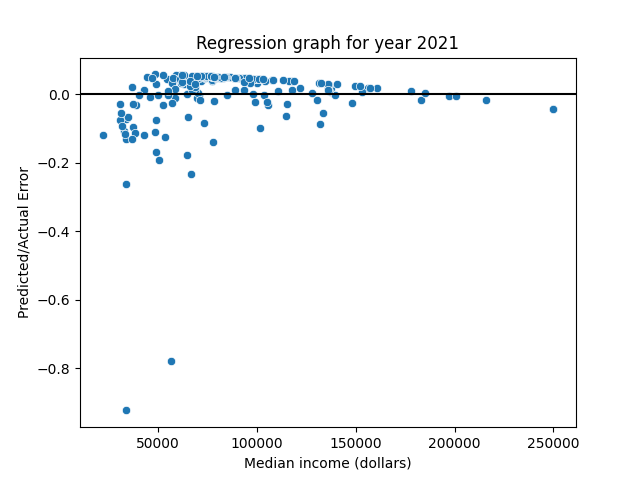
Important notes:
- Predicted / Actual Error is the difference between the H/H Ratio predicted by the model and the actual H/H Ratio for a given ZIP code.
Here we can see:
- Asides for a couple of outliers, most points stick close to the line.
- While the points below the line are farther away, there are more points above the line. These two details cancel each other out, leaving the distribution of points sort of balanced on both sides of the line. To see this in more detail, see the below image that shows the regression without outliers.
Image 2.5: regression graph, with outliers removed.
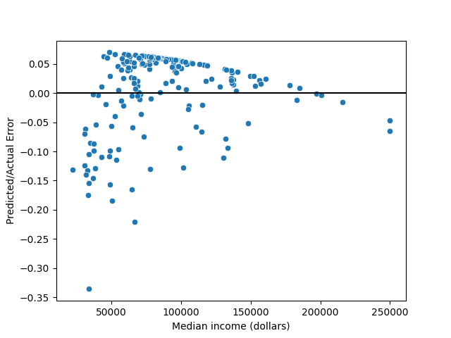
Image 3: comparison of various models.
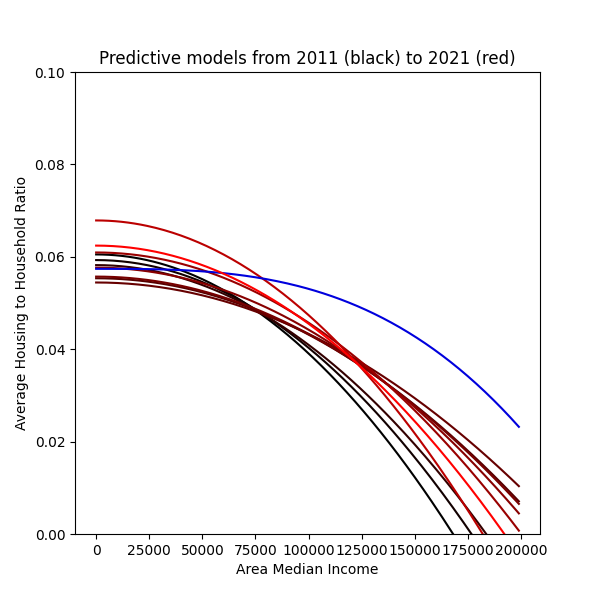
Important notes:
- Regression lines are colored based on proximity from the present. The brighter red a line is, the closer to 2021 its corresponding regression is tailored for.
- The 2020 line is drawn in blue to highlight that something is off about it.
Here we can see (assuming the regressions, except for the 2020 line, are reasonably accurate):
- The 2021 regression is very “middle of the line” compared to the other lines.
- The affordable housing issue in NYC seem to have improved since 2011, reached a high point in 2015, then backslid until now.
Maps: H/H Ratios per ZIP code and Average Median Income per ZIP code, in HTML map format
Since Markdown does not support direct embedding of HTML files, I have included links to them instead. Open them in a new window to see them.
Important notes:
- Some ZIPs are filled in with dark gray instead of the yellow-red palette. These ZIPS either have 0 population (and is thus irrelevant to the analysis), such as JFK Airport and Central Park, or are outliers with very high H/H Ratios. The latter had to be dropped because they skewed the color palette and caused all other ZIP codes to all be assigned a yellow tone. This erased much of the details that I wanted to show.
- There appears to be a negative correlation between median income and Housing / Household Ratio. The rich ZIP codes - downtown to midtown Mahnattan, the tip of Staten Island, portions of Queens - had low H/H Ratios. Meanwhile, poorer ZIPs - uptown Manhattan, southern Bronx, Chinatown, East New York - had higher H/H Ratios.
Sources
See COPYRIGHT.txt.